affiliate · marketing
Short Links for Affiliate Marketing: A Practical Guide
How affiliates tidy long tracking URLs, measure which placement earns, re-point links when a program changes, and stay within disclosure rules.
7 min read
qr · marketing
Where QR codes get scanned, how large to print them for the distance, why the code should hold a short link, and how to measure scans per placement.
QR codes on printed material fail for boring reasons. The code is too small for where it's placed. It's on something people can't stand still in front of. It encodes a long URL that's dense and fragile. And when it does get scanned, nobody can tell, because the destination is the same page the website links to and the scans vanish into "direct traffic". None of those problems are about QR codes as a technology; they're about placement, size and measurement, and each has a simple fix.
This guide covers the fixes in the order you'll meet them: deciding where a code goes and how large it must be there, what to encode (a short link, always), how to measure scans per placement, and the production details that separate a code that scans first time from one that makes people give up.
A QR code is scanned by someone who has a phone in hand, a few seconds, and a reason. Design around those three.
Places where all three are true:
Places where at least one is false:
The rule of thumb: if a person can stop, face the code squarely at under two metres and hold their phone steady for two seconds, it will be scanned. Otherwise it's decoration.
Size follows scan distance. The dependable rule is that the code's width should be at least one tenth of the distance it's scanned from; more for dense codes or poor light.
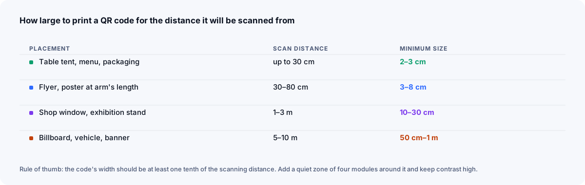
| Placement | Typical scan distance | Minimum code width |
|---|---|---|
| Table tent, menu, packaging, receipt | up to 30 cm | 2–3 cm |
| Flyer, poster read at arm's length | 30–80 cm | 3–8 cm |
| Shop window, exhibition stand, wall poster | 1–3 m | 10–30 cm |
| Large banner, vehicle side, billboard for pedestrians | 5–10 m | 50 cm–1 m |
Two things shrink the safe size further:
go.you.com/menu, and each module is smaller for the same overall size. Encoding a short link makes the code sparser and easier to read at every size — which is the first reason to always encode a short link.Print the code, put it where it will live, step back to the real distance, and scan it with the oldest phone in the office. That test costs nothing and catches most failures.
The code should hold a short link on your domain, not the destination URL. Three reasons, each sufficient on its own.
The pattern on the paper never changes. A short link's destination can be edited at any time. A menu code that points at go.cafe.com/menu shows the September menu today and the October one next month, on the same printed cards. A code that encodes cafe.com/menus/september-2026.pdf is wrong on the first of October and stays wrong until you reprint. Editable destinations are the main reason to put a shortener behind print at all.
Fewer characters means fewer modules means a code that scans from further away, on worse paper, with a worse camera. A URL with UTM tags on it can more than double the module count.
A code that encodes the destination directly sends scans into the destination's "direct" traffic, indistinguishable from someone typing the address. A code that encodes a short link gets counted by the shortener — with time of day, country and device — and if each printed placement has its own short link, you learn which placements work. That's the next section.
You get the tracking without any tags visible to the reader: the short link's destination can carry UTM parameters invisibly, so your site analytics also see "print / flyer / spring-2026".
The method is the one that works for every channel: one short link per placement. The flyer gets /spring-flyer, the table cards get /menu-table, the window poster gets /spring-window, the packaging gets /setup-box. Same destination, different links, and now each code's scans are its own number.
On Xlyl's statistics page each link shows its clicks by hour and day, the country and city-level region of the scanner, and the device. For print, the hourly chart is unusually informative: table-card scans cluster around meal times; a poster in a station peaks with commuter hours; a code in a monthly magazine trickles for weeks. The device split tells you what the code was scanned with, which matters for how the destination should be built (almost entirely phones, so the landing page had better be fast and mobile-first).
Bot traffic — link previews, mail scanners — is filtered before counting, so a scan count is people. Each scan keeps its location and device; visitor IPs are never stored.
Generating the code is one click on any link in the dashboard: the QR code generator produces a downloadable code that encodes the short link, so the code, the link and the count are one object.
The code needs a margin of blank space on all four sides — at least four modules' width, more is safer. Designers routinely crop it to fit a layout, and the code stops scanning. Treat the quiet zone as part of the code.
Dark modules on a light background. Black on white is safest; a dark brand colour on white or cream is fine; anything inverted (light on dark) fails on many readers, and low-contrast pairs (mid-grey on white, two mid-tones) fail on most. If the code sits on a photograph, put it in a white box.
QR codes carry redundancy so they scan when partly obscured. The four error-correction levels are part of the ISO/IEC 18004 standard and recover roughly 7%, 15%, 25% and 30% of the code. Higher error correction (level H) lets you put a small logo in the centre and survive scuffs, at the cost of more modules. For print, level M or Q is a good default; use H only if you're overlaying a logo, and then keep the logo under about 20% of the area.
Flat, matte, opaque. Glossy laminate reflects the phone's flash; curved bottles distort the pattern; fabric blurs it; glass adds reflections. If the surface is unavoidable, go a size up and test on the real thing.
Put a line of text beside the code: what the reader will get, and the short link itself in words — "Scan for the menu · go.cafe.com/menu". The text gives non-scanners a way in, tells scanners what they're about to open, and doubles as the fallback if the code is damaged. It's also why the alias should be short and readable.
Everything above is wasted if the destination is slow or built for a desktop. Nearly every scan comes from a phone, often on mobile data, often outdoors. The page must load fast, fit the screen, and do the one thing the code promised. If the destination is a PDF, keep it small. If it's a form, keep it short.
And because the short link can be edited, you can fix a bad landing page after the print run — which, in practice, is the QR feature people end up most grateful for.
Seven yeses and one scan is all it takes.
affiliate · marketing
How affiliates tidy long tracking URLs, measure which placement earns, re-point links when a program changes, and stay within disclosure rules.
· 7 min read

social · marketing
How Instagram, X, TikTok, LinkedIn, YouTube and WhatsApp treat links, why branded links get more taps, and how to run a link-in-bio on your domain.
· 7 min read
marketing · analytics
Which UTM parameters to use, how short links hide the tags, why one link per channel is the rule, and how to read link and site analytics together.
· 8 min read